4 June 2026 · Payal Chetwani
Why Your Instagram Feed Looks Generic - and the Visual System That Fixes It
In an age where every brand vies for attention on Instagram, many feeds have begun to blend into an indistinguishable visual noise. We've all seen them: the same gradients, the stock-templated reels, the emoji-laden captions. This isn't just a coincidence; it's often a symptom of a missing strategic framework. This post delves into why this visual sameness is so prevalent and introduces the robust solution: a meticulously crafted visual system that breathes distinctiveness back into your brand's digital presence.
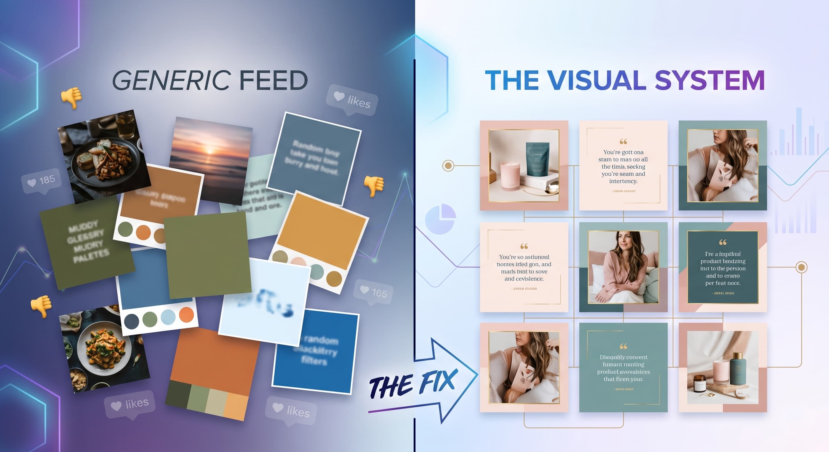
The Echo Chamber of Sameness: Why Feeds Blend In
Walk through any local market, scroll through your Instagram feed, or browse a curated list of emerging brands, and a pattern emerges. You see a profusion of identical aesthetic choices: the ubiquitous pastel gradients, the stock video templates re-skinned with a logo, the captions heavy with an almost uniform set of emojis. It’s a visual monoculture that stifles genuine connection and makes genuine brand recognition difficult. From a systems perspective, this isn't random; it's a predictable outcome when brands prioritize chasing fleeting trends over establishing a core visual language.
The reasons for this convergence are multifaceted. Often, it stems from a reactive approach: seeing what works for a competitor and attempting to replicate it. There’s also the accessibility of templated design tools, which, while democratizing content creation, can inadvertently homogenize output if not guided by a strong brand identity. For many businesses, especially those in fast-paced sectors like F&B in Ahmedabad, the sheer pressure to produce content daily means expediency often trumps originality. The result? A feed that might tick the boxes for "active," but utterly fails to communicate anything unique about the brand behind it.
Beyond the Fleeting Trend: What a Visual System Truly Is
The antidote to this visual sameness isn't just "better design" or "more unique photos." It's a comprehensive, strategic framework we call a visual system. Think of it less as a style guide and more as the DNA of your brand's visual communication across all touchpoints, especially on a dynamic platform like Instagram. It’s about establishing a set of deliberate, repeatable rules and elements that, when combined, create an unmistakable and consistent brand presence.
A robust visual system goes far beyond surface-level aesthetics. It’s deeply intertwined with your overall brand identity – the values, personality, and promise your business makes to its audience. It provides the guardrails and the creative sandbox simultaneously. It answers fundamental questions like: What colours genuinely represent us? What tone of voice do our visuals convey? How do we ensure every piece of content, from a quick story to a polished brand film, feels intrinsically *ours*? At P2V Labs, our work on brand visual systems for clients across Gujarat focuses on embedding this core identity into every visual element, ensuring that distinctiveness is not an afterthought, but the foundation.
The Pillars of a Distinctive Visual System
Building a visual system involves defining several key components that work in harmony. These aren't rigid constraints but rather intelligent frameworks that guide creative decisions, allowing for variety without sacrificing recognition.
- A Fixed Palette and Usage Logic: This isn't just picking three colours. It's defining primary, secondary, and accent colours, and establishing rules for their application. When do we use a bold pop, and when do we lean into muted tones? For a restaurant client, for instance, a fixed palette might dictate that food photography uses natural, warm tones to evoke freshness, while promotional graphics might incorporate a vibrant brand accent.
- A Typographic Anchor: Your fonts are as much a part of your voice as your words. A visual system defines a primary headline font, a secondary body font, and perhaps an accent font, along with rules for sizing, weight, and hierarchy. This ensures readability and consistent tone across all text-based visuals, from Instagram carousels to promotional reels.
- Recurring Grid Logic and Layout Principles: How do your posts sit together? Are they always centred? Do you use a consistent margin? Do you alternate between full-bleed images and graphic overlays? A defined grid logic brings order and sophistication to your feed, whether you're showcasing product photography or behind-the-scenes glimpses. It's about intentional negative space and visual rhythm.
-
Recurring Content Formats: This is where the system truly allows for dynamic content while maintaining identity. Instead of randomly generating content, you define recurring types that align with your brand's communication goals:
- Founder POV Reels: Consistent visual style, background, and tone for Vrithik, Payal, or Palash (or your client's founder) sharing insights.
- Behind-the-Scenes (BTS) Glimpses: A specific filter, framing, or editing style for showing the human side of the brand.
- Customer Voice Highlights: A template for showcasing testimonials or user-generated content, making it instantly recognizable as a brand endorsement.
- Product/Service Showcase: A standardized approach to photographing and presenting offerings, ensuring consistency whether it's a new dish from one of our 150+ restaurant clients or a feature of a new service.
"True distinctiveness isn't about being loud; it's about being unequivocally yourself, consistently. A visual system provides the blueprint for that authenticity."
The Power of Intentional Variety
One common misconception is that a visual system stifles creativity or leads to a boring, repetitive feed. On the contrary, it liberates it. By defining the core elements, you create a robust framework within which you can experiment and innovate. Imagine a client in the apparel industry. With a defined palette, typography, and grid, they can feature a new collection with fresh models and locations every season, knowing that the underlying visual grammar will always tie it back to their brand. The clothes change, the story evolves, but the brand’s visual signature remains.
This allows for intentional variety. You can introduce seasonal campaigns, celebrate festivals, share team moments, or launch new products – all while staying true to your core visual language. The system provides the roots, allowing the branches to grow in diverse directions without losing connection to the trunk. It’s how a brand can produce engaging social reels one day and a polished brand film the next, with both feeling like they belong to the same narrative. This strategic agility is crucial for keeping an Instagram aesthetic fresh and engaging over time, preventing follower fatigue while deepening brand recognition.
From Concept to Consistency: Implementing Your System
Developing a visual system is the first step; maintaining it requires discipline and an understanding of the principles. This isn't about a one-time design project, but an ongoing commitment to upholding your brand's visual standards. For our plan clients, this means a continuous dialogue and systematic content creation that adheres to the established framework. It involves:
- Detailed Guidelines: A clear, accessible document (often hosted on our client portal at clients.p2vlabs.in) outlining all components and their usage.
- Dedicated Creative Direction: Ensuring that every piece of content, whether it’s food photography or a social reel, is produced with the system in mind.
- Regular Review and Refinement: While the core principles remain, a system can evolve subtly over time to stay relevant without losing its essence.
The goal is to ensure that anyone interacting with your brand, from an internal team member to a new customer, experiences a cohesive and professional visual narrative. This meticulous approach is how we've helped clients achieve over 5M+ views across their reels and maintain a 90%+ plan renewal rate – because consistency breeds trust and distinctiveness commands attention.
The P2V Labs Approach: Crafting Your Unique Narrative
At P2V Labs, based in Ahmedabad, our passion lies in transforming generic digital presences into powerful visual narratives. We understand that your brand deserves more than off-the-shelf templates. Our team – Vrithik, Payal, and Palash – approaches each project with a blend of artistic vision and systematic thinking, creating visual systems that are as unique as the brands they represent. We believe in an editorial, restrained aesthetic, drawing inspiration from timeless design principles rather than fleeting trends. This means focusing on thoughtful composition, authentic storytelling, and a sophisticated visual language that stands the test of time.
Whether you're looking for compelling food photography starting at ₹8,000, engaging social reels, a comprehensive monthly plan for consistent content creation (starting at ₹20,000/month), or a powerful brand film (from ₹35,000), our services are built around the principle of creating a cohesive, impactful visual system. We don't just deliver assets; we deliver a strategic framework that elevates your brand and ensures it resonates authentically with your audience.
Investing in a well-defined visual system is not an expense; it’s an investment in your brand’s long-term recognition, credibility, and impact in a crowded digital world.